


A couple weeks ago, I posted a brief walkthrough of the Colorado economic indicators dashboard I host on my website. Doing that post and seeing similar dashboards (like this one from Alexander Salter) made me realize mine was missing inflation. Well, the dashboard now includes inflation data: the Denver metro area CPI compared against the U.S. city-average CPI, along with a table of Denver metro CPI components.
You can access the dashboard here. Below I will show a few screenshots of what the new inflation tab looks like and explain what is included.
Chart Comparing Denver MSA CPI to U.S. City-Average CPI
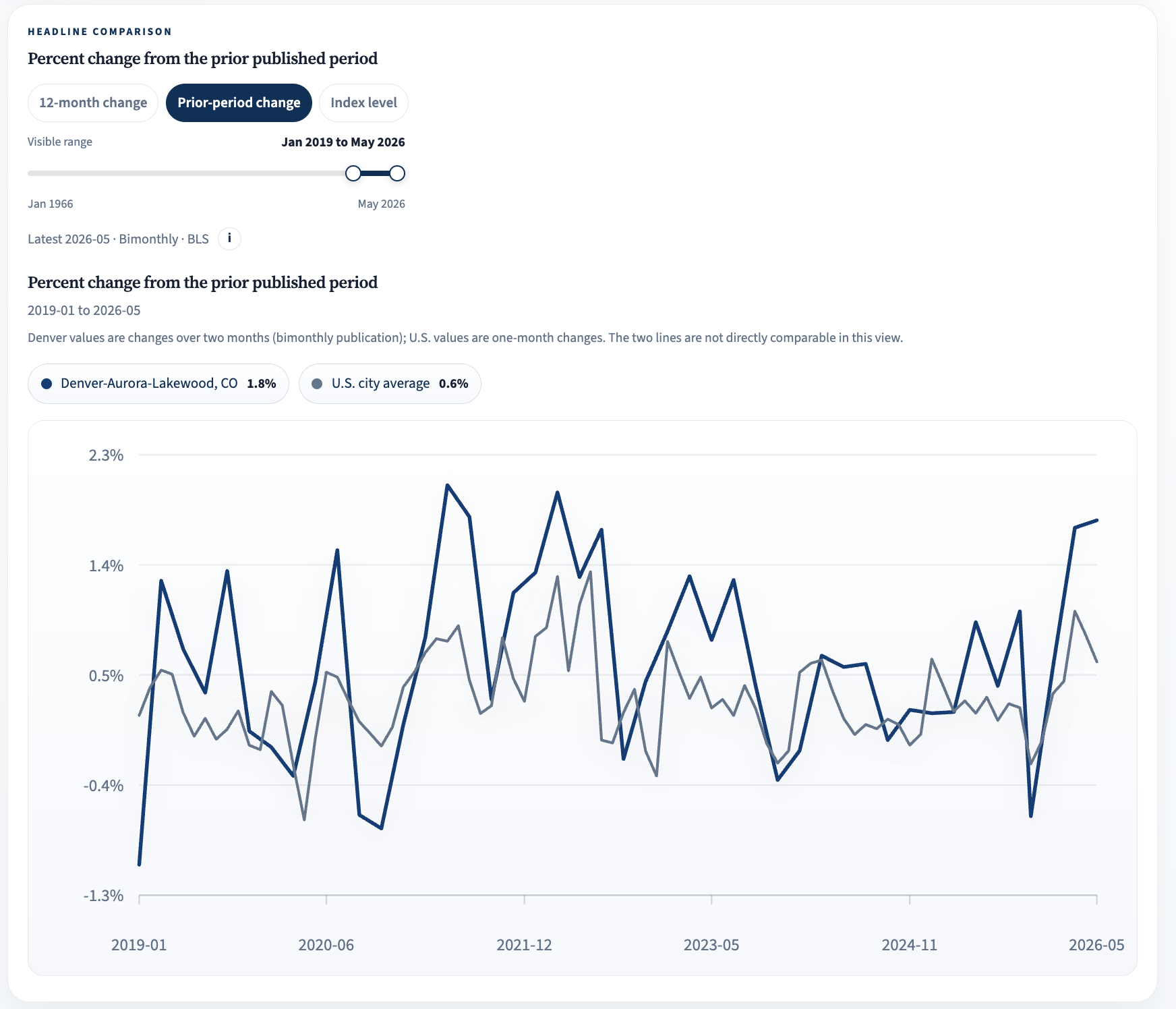
The first thing you will see on the inflation tab is a chart where you can compare inflation and the price index for the Denver-Aurora-Lakewood MSA against the U.S. city average. There are three views you can switch between, matching the tabs on the chart including the 12-month change, the change from the prior published period, and the index level itself. The screenshots below show each of these views for the data from January 2019 to May 2026, but the visible range is adjustable if you want a longer or shorter window.
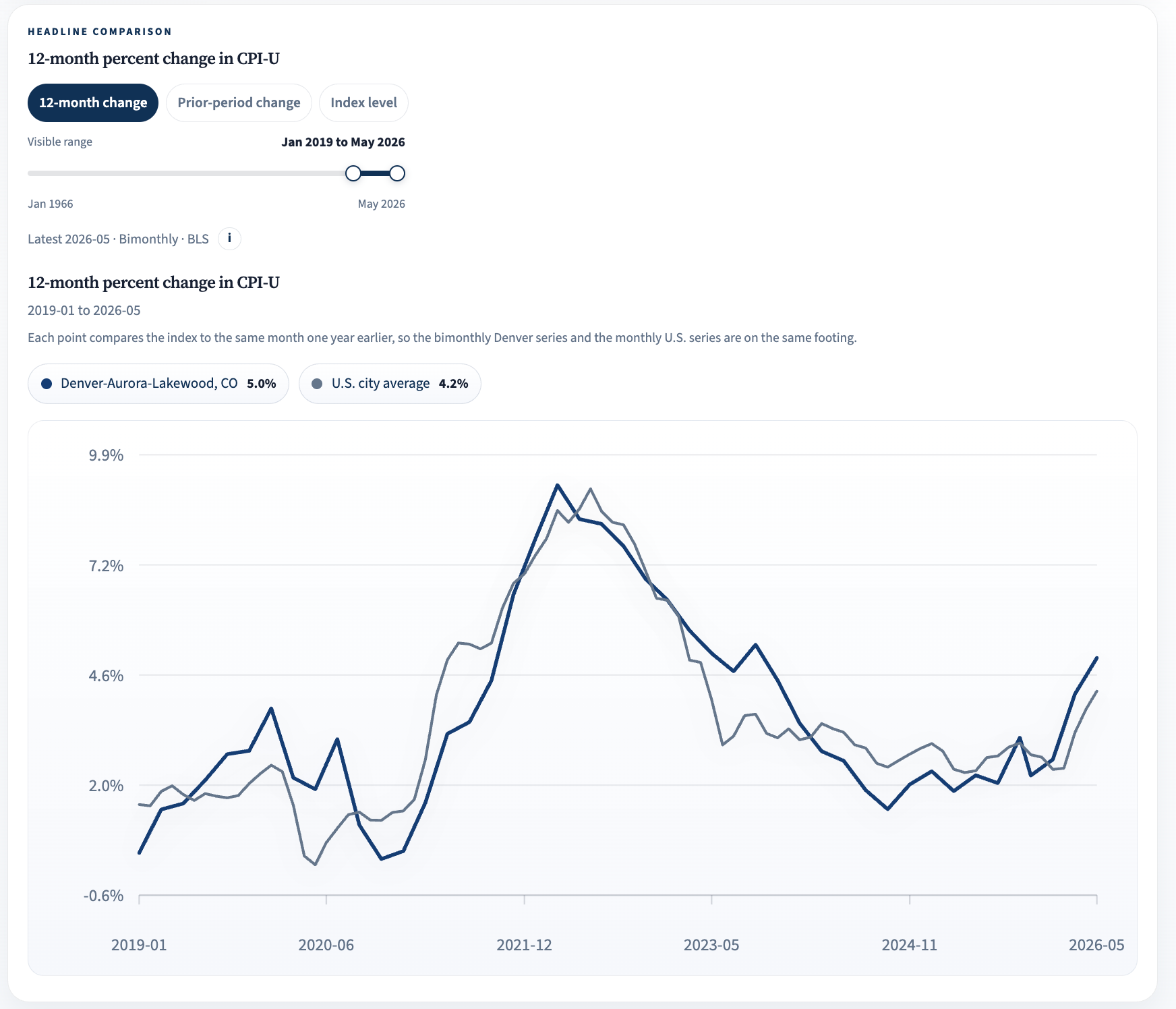
The 12-month change is the standard headline inflation measure, and right now it shows Denver-area prices up 5.0% over the year ending May 2026 compared to 4.2% for the U.S. city average.
One thing worth knowing when reading these charts is that the Denver MSA CPI is published every other month while the national series is monthly. That doesn’t matter much for the 12-month view, but in the prior-period view below, the Denver line shows two-month changes against one-month changes for the U.S., so the two lines are not directly comparable there (the chart notes this as well).
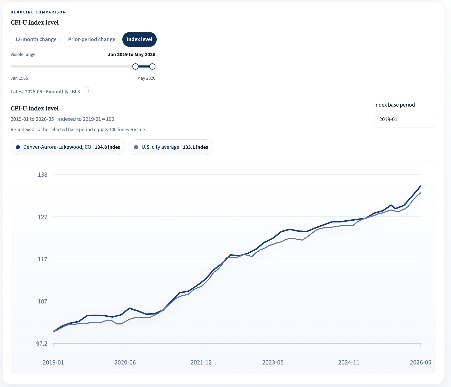
The index level view also lets you choose the base period, with every line re-indexed to equal 100 at whatever period you select. In the screenshot above, the base period is January 2019.
Denver-Aurora-Lakewood MSA CPI Components Table
Below the chart is an interactive table where you can add or remove the published components of the Denver metro CPI, modeled on the BLS news-release table. Not every component is published for the Denver MSA, but the big ones are there including food, energy, gasoline, shelter, and all items less food and energy among a few others. Columns show the latest index value, the 12-month and prior-period changes for the Denver area, and the 12-month change for the U.S. city average. The table doesn’t allow comparisons across different time periods but gives a quick look at how the most recent price changes in the Denver area compare to the average around the country.
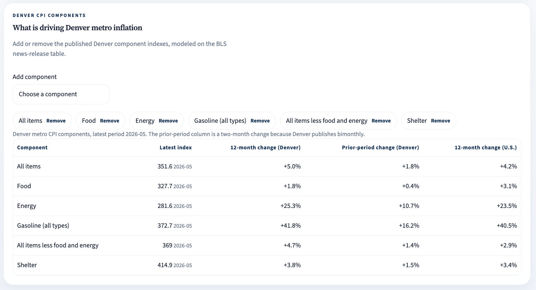
A standout in the screenshot above is gasoline. Gas prices in the Denver area are up nearly 42% over the year ending May 2026, compared to 40.5% nationally. The table also makes it easy to see what is driving the recent local numbers which most recently is energy, not shelter. Shelter prices in the Denver area are up a modest 3.8% over the same period while energy prices are up more than 25%.
As before, I added the inflation tab with the help of Claude Code.