


A few months ago, I came across one of Scott Cunningham’s Substack posts on using Claude Code. I’d used AI tools since ChatGPT launched in 2022 for a bunch of different tasks in my work but had no idea what coding agents were in early 2026. Scott’s series on Claude Code is fantastic, and if you have not used coding agents yet they are a great place to start. And for me, it became instantly apparent that I was behind on AI. I downloaded Claude Code and started playing around with it in the terminal. I only had the $20/month subscription and hit my 5-hour limit very quickly. But OpenAI had their own coding agent and desktop app in Codex. I downloaded that and started using it. Same $20/month but wasn’t hitting my usage limits.
After a few hours of seeing how Codex was different than using a chatbot, I wanted to see how much it could really do. I had been thinking about creating a data dashboard for Colorado economic data but kept putting off learning how to do this. I know how to code OK in R and Stata but didn’t know the first thing about making a dashboard. I put an empty folder on my Desktop and put Codex to work with my idea to pull BEA and BLS data for an interactive dashboard on Colorado economic indicators, with a focus on the Denver-area counties.
The first version was crude and not what I wanted but over the course of a couple days and in total maybe a few hours of working with Codex, I had a pretty nice looking dashboard that fit what I had imagined before starting. I now host that dashboard on my website and it is linked on the homepage of Front Range Economics here on Substack. You can follow the link here to check it out for yourself.
The purpose of this post is to provide a short walk-through of the dashboard and explain why I think it is a useful tool for anyone interested in Colorado economics (and some self-promotion). I see this dashboard as easier to use than the BEA or BLS websites themselves, and much of the data is downloadable.
I’ll give a brief walk-through of the features on the dashboard and then give an example of what kind of questions you can answer using this data. Obviously, I won’t take credit for the data itself. None of this would be possible without government sources like BLS and BEA. I guess I can’t even take credit for the dashboard itself, I didn’t write a line of the code that went into this. I only guided Codex (and later made improvements with Claude Code) on what I wanted to include, how I wanted it to look, and other tweaks along the way. I am also interested in improving this any way I can, so please reach out if you have any suggestions or ideas for what should be added or changed.
The Dashboard Homepage
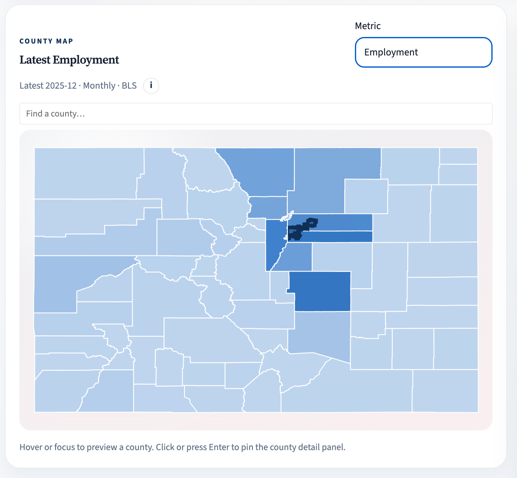
The first thing you will see when you open the dashboard in your browser is an interactive county map of Colorado. The screenshot below should give you an idea of what it looks like when the chosen metric is employment. There are five metrics you can choose from to populate the map including employment as shown in the screenshot, real GDP, per-capita personal income, unemployment rate, and average weekly wages. Again, these are sourced from the BEA and BLS.
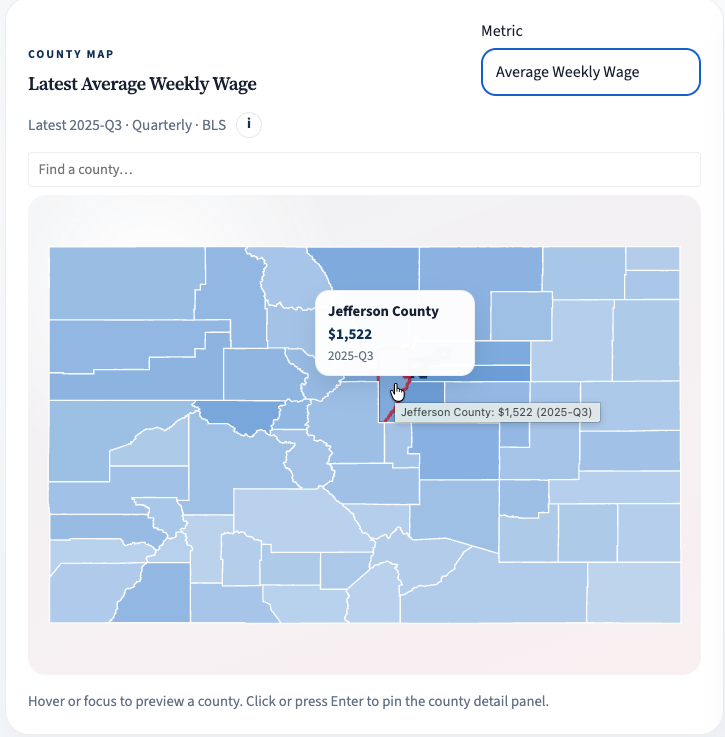
When you choose a metric, you can hover over a county tile to see the most recent available value for that county. For example, looking at average weekly wages, we can see Jefferson County’s were $1,522 in Q3 2025. There is also a search bar you can use to find the county you want rather than hovering around the map.
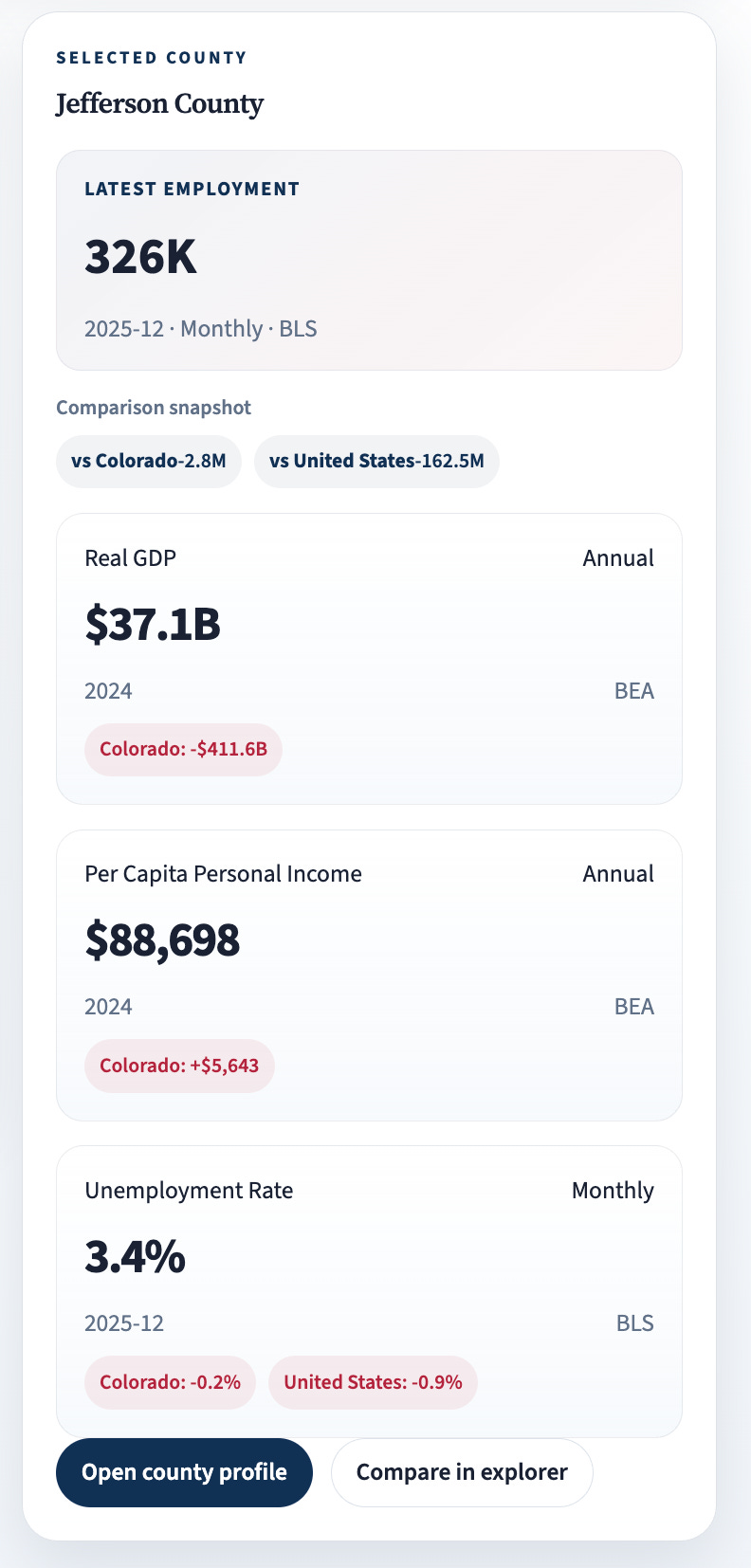
If you click a county on the map, or search for a county and hit enter, you will select that county to be highlighted and populate a profile card to the right of the map. The example profile card below shows the most recent available values for four out of the five metrics. The metric at the top is whatever your selected metric is on the map (in this case employment) and then below are real GDP, per-capita personal income, and the unemployment rate. This gives a snapshot of economic conditions for that county.
The Data Explorer
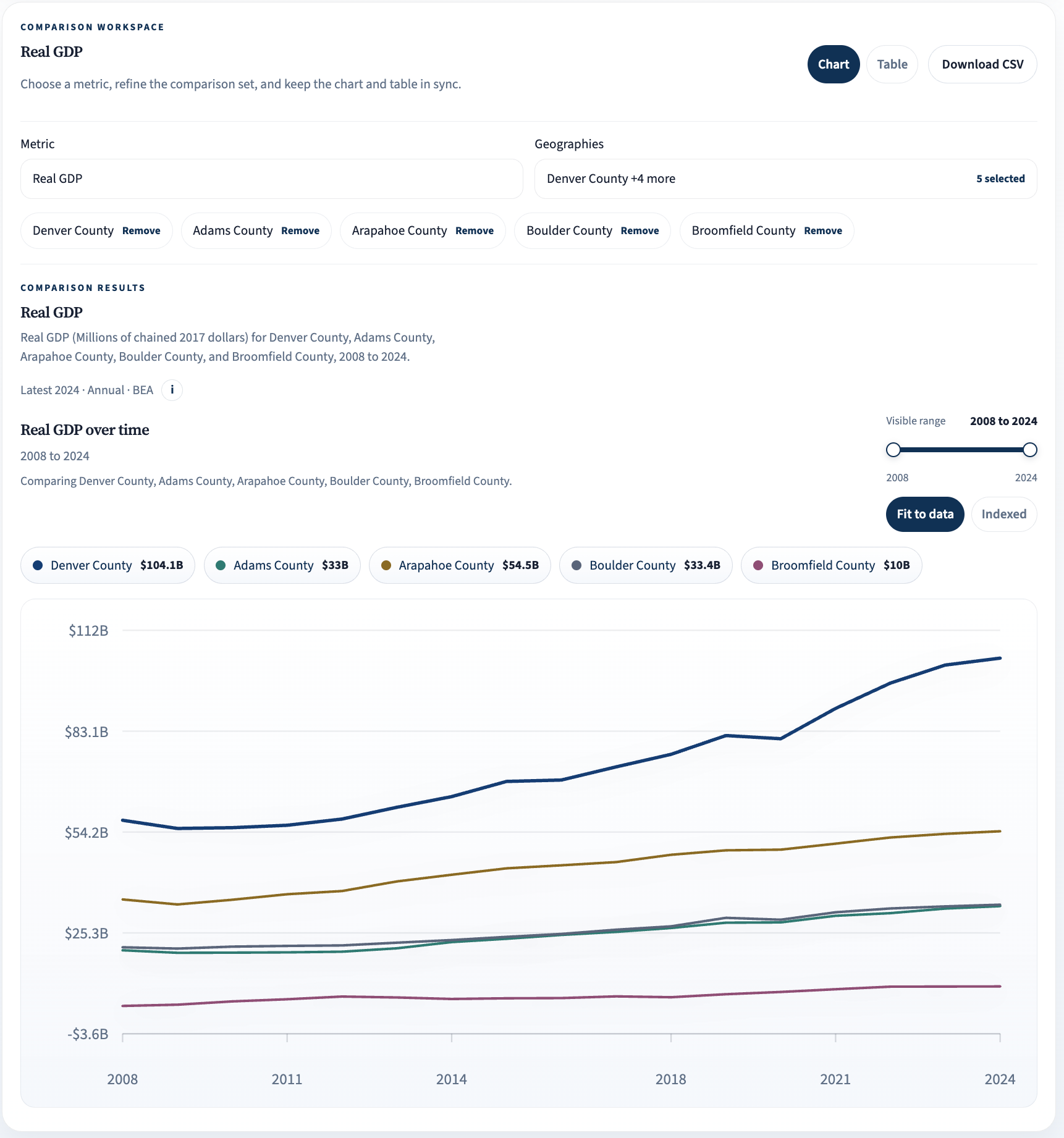
Along the top of the page you will see tabs for other parts of the dashboard. The next one I’ll discuss is the Data Explorer. This allows you to compare any of the five metrics from the main page across counties, metro areas, Colorado as a whole, and the nation. The example below is comparing real GDP from 2008 to 2024 for Denver, Adams, Arapahoe, Boulder, and Broomfield counties. In this comparison we can see that Denver County has experienced substantially more growth in real GDP than some of the surrounding counties over the last 16 years. Geographies are chosen via a dropdown menu and can be found via search on the menu as well.
The Denver Region Tab
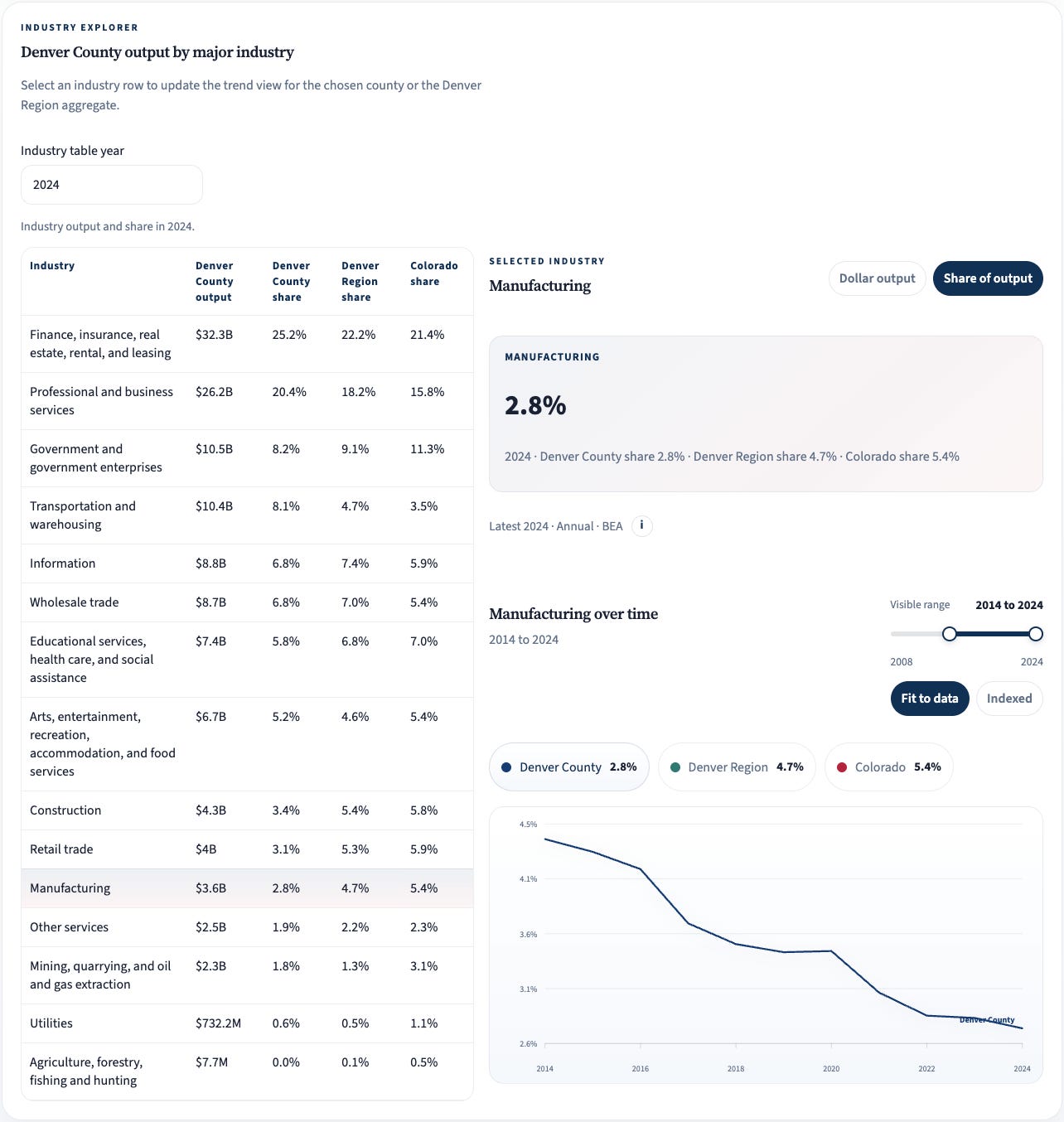
The final tab I will discuss is the Denver Region tab. This part of the dashboard focuses on data for the seven counties making up the Denver area. The Denver-Aurora-Centennial MSA is actually made up of 10 counties in the area, something I will address next time I update the dashboard. To me, the most interesting part of this tab on the dashboard is the look at output by major industry. At the top of this page you can choose a county, and then scroll down to the industry explorer and choose a year. On the left of the industry explorer there is a table as shown below listing several major industry categories with dollar output in the county, output share in the county, output share for the Denver region (defined by the aggregate of the seven counties included on the page), and share for the entire state. Note that for the Denver region and Colorado columns, the figure is not the selected county’s share of output, but the industry’s share of output at the region and state levels.
The example below shows the industry explorer for Denver County in 2024. We see the largest major industry by output in Denver is finance, insurance, real estate, rental, and leasing with over $30 billion in output making up just over a quarter of all output for the county. You can also click one of the major industries in the table to highlight it on the right side of the industry explorer. Here, manufacturing is chosen, and in the graph of share of output we can see the decline of manufacturing in Denver from just over 4% of output to just under 3%. There is also the option to make comparisons to the Denver region and Colorado in the graph, though not shown in the screenshot.
Industry Composition Across Three Counties
Now that you have an idea of how to use the dashboard and the data that is available, I want to give an example of the kind of descriptive question you could answer using it. Let’s do a comparison of industry composition across three counties: Denver, Arapahoe, and Adams. I’ll limit this to looking at the top five major industries for each county in 2024 and frame the question broadly. What are the main differences in sources of output across the three counties? Tables showing top five major industries for each county are shown in the screenshots below.
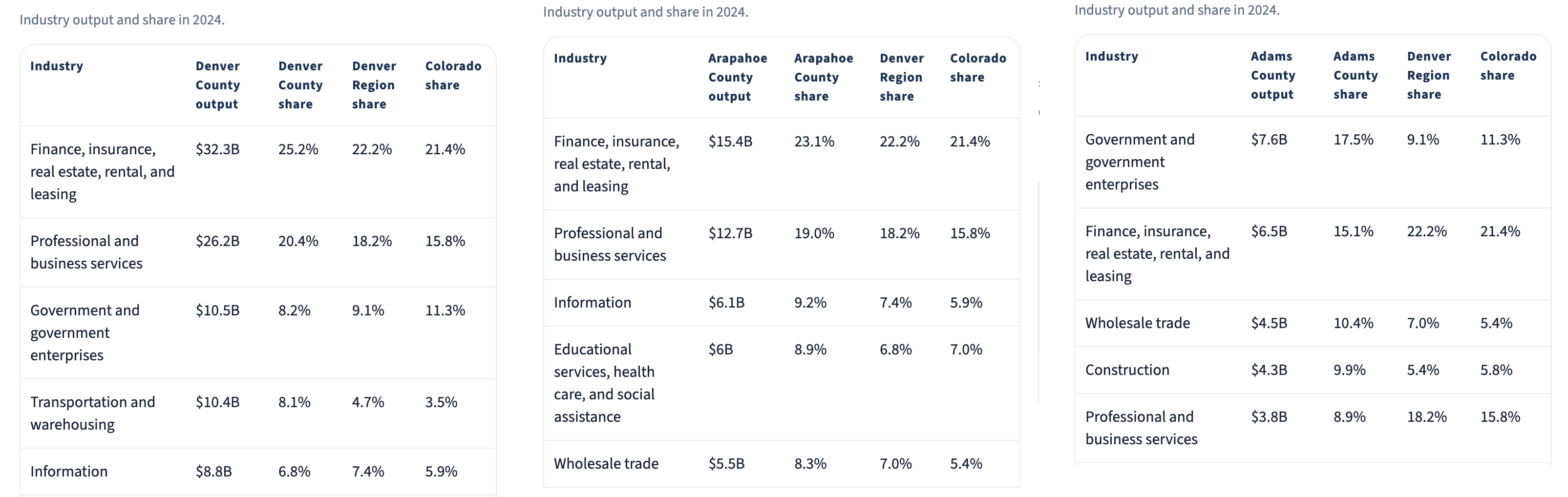
Looking at Denver first, we see in 2024, just over 45% of all output came from two major industries (finance and related businesses and professional and business services). The next three biggest contributors include government, transportation and warehousing, and information whose summed output share is still less than that from finance and related businesses. As far as top two major industries, Arapahoe is similar to Denver with around 42% of output coming from finance and related businesses and professional and business services. But Arapahoe looks a bit different when we look at the remaining top contributors which include information; education, health, and social assistance; and wholesale trade. Finally, Adams looks the most different among the three with the largest industry being government at over 17% of total output and finance and related businesses trailing closely behind. The remaining top contributors in Adams consist of wholesale trade, construction, and professional and business services. Finance and related businesses are clearly major contributors to output across all three counties, but there is substantial diversity as well, even when only looking at the top five.
You could use these same tables to make comparisons to the Denver region or Colorado as a whole, or choose a different set of counties to make additional comparisons. There’s a lot of data there and plenty to dig deeper into.
I’ll leave it at that. Take a look around the dashboard for yourself, and again reach out if you have any suggestions.